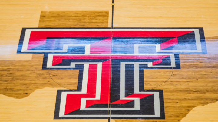
Wednesday, the Texas Tech basketball program revealed a new court design for the United Supermarkets Arena that really pops.
It’s become trendy for college basketball programs to trick up their court designs in recent years. But Wednesday, we learned that the Texas Tech basketball program has gone the opposite way when redesigning the court at United Supermarkets Arena.
Doing away with the old design, which featured wood-stained lanes, a wood-stained state of Texas at center court, and red baselines and sidelines, the program has gone over to the dark side. The new design features black lanes, 3-point lines, baselines, and sidelines while doing away with the state of Texas at center court. It also appears that the Double-T at center court is enlarged (though it may just look that way standing by itself and not over the outline of the state) and that the overall color of the hardwood is lighter.
Also, the area between the free-throw line and the 3-point line is now the same color as the rest of the court. Previously, that area had been stained the same color as the lane making that area look like a grain silo.
Many Texas Tech fans will be happy to see that the Red Raiders have gone away from having a similar design on their court as both Texas and Texas A&M have. Both of those programs also had their school logo over the top of the state of Texas at center court and if memory serves me right, both went to that look before Tech did.
The design was revealed by the program in a time-lapse video showing the entire process of taking up the old floor and installing the new one. One has to wonder if the old court is being placed in the new Dusting R. Womble practice facility across the street from the U.S.A.
https://twitter.com/TexasTechMBB/status/1252959274063597569?s=20
Speaking of Womble, perhaps the program’s largest booster, he also Tweeted out a mockup of the new design. Unfortunatley for one fan, he sent it out in response to that fans’ fantastic replica of the old court design that he put on a table.
Probably not a good time to tell you that the USA court has been redone pic.twitter.com/f12DkaKt8H
— Dustin Womble (@DustinWomble) April 22, 2020
In recent years, many programs have become caught up in the rush to make their courts more futuristic in their appearance and the results have been rather…interesting. For instance, consider Oregon’s court design, which is supposed to give fans the feel of looking through the forest but which is just tough to look at.
https://twitter.com/OregonMBB/status/1236529772043186177?s=20
Another program that has a court that is hard to stomach is Memphis. Celebrating their 100th season, they went to a design that had the area outside of the 3-point line painted blue, the area inside the arc blonde wood, and the lane painted blue in the design of tiger stripes.
ICYMI: The fans in attendance at Memphis Madness were treated to the first public look at the new basketball court at FedExForum#GoTigersGo pic.twitter.com/fLp42OeJy3
— Memphis Basketball (@Memphis_MBB) October 4, 2019
Meanwhile, UNLV now has one of the busiest court designs on the planet. Running along the sideline is an outline of the Las Vegas skyline, which includes a pyramid, the Eiffel Tower, a Ferris wheel, and a roller coaster.
UNLV's new basketball court... pic.twitter.com/SOMdoAos0o
— Darren Rovell (@darrenrovell) November 8, 2017
In Fort Collins, Colorado, the Colorado State Rams have leaned heavily into the idea of incorporating the team’s logo into the court design. Their floor has a pair of ram horns on it to make it look like you are looking at an oncoming Ram.
Meanwhile, the San Jose St. Spartans have one of the worst courts in the nation. In something that looks like a bad photoshop job, they have painted five massive Spartan warriors in the middle of the floor. But on top of that, they’ve also crammed the school logo into the middle of the floor. It looks like a terrible paint job that one might see on the wall of a children’s Sunday school classroom.
New San Jose State basketball court (H/T @meredithfrost, @bupsjones) pic.twitter.com/9FBZtobFVt
— Darren Rovell (@darrenrovell) October 8, 2013
While Tech has gone away from the stained wood look, Central Florida once leaned all the way into that concept in 2013. Trying to make their court look like a blacktop outside court, they stained the area outside of the 3-point lines grey a few years ago. However, they did have solid black baselines and sidelines like the Red Raiders now have and since then, the Knights have gone back to a more traditional look.
UCF basketball court tough af pic.twitter.com/rYbQLhG7xV
— Allec Williams (@awillfromthe9) January 14, 2014
Of course, one of the worst courts in the world resides in Texas. TCU has tried to replicate the look of reptile skin by putting scales over the entirety of their floor. It is one of the toughest courts on which to watch a game in the entirety of recorded human history. What’ makes that floor so hard to look at is how overpoweringly bright it is as it almost feels like we are staring into the sun when having to watch a game at Schollmaier Arena.
Fortunately, Tech has pivoted and gone the other way by simplifying its court design. This is a classic look that differentiates the U.S.A. from the Longhorns’ and Aggies’ courts and it’s a bit of a throwback, which is perfect because Beard’s program has embodied a no-frills, old-school mentality as well.
