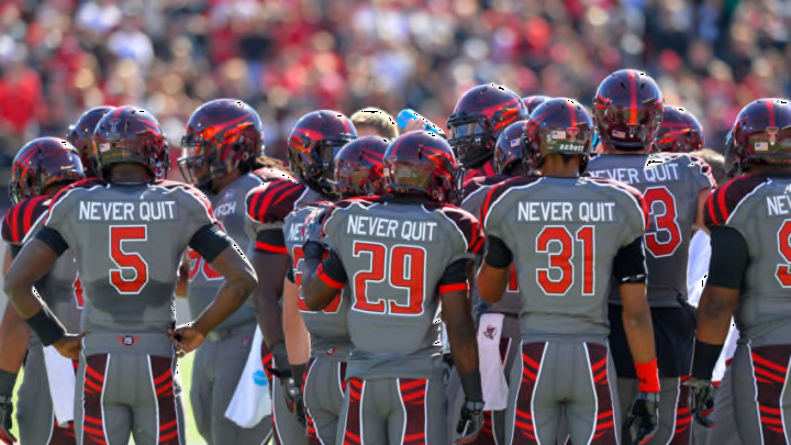
No. 8: Wounded Warrior Uniforms 2011
The worst blowout loss in Texas Tech football history also took place while the Red Raiders were in one of the worst uniforms we’ve seen. Decked out in a futuristic Wounded Warrior Project (W.W.P.) getup, Tech lost the 2011 home game against Oklahoma State 66-6.
Theme games tend to bring out awful uniform concepts and the Wounded Warrior idea, while well-intentioned, was poorly executed. About the only positive one could say about these threads was the fact that they didn’t have any strange colors on them like other theme uniforms that we will see later on this list. That is unless one takes into account the Double T logo on the helmets, which was filled with the American Flag.
But what truly didn’t work for this concept was the strange patterns on the shoulders and down the back of the pants. It was some type of silver or metallic-looking pattern that was supposed to tie into the Wounded Warrior theme but it made the uniforms look like the costumes from a Michael Jackson video.
What’s more the placement of the designs on the pants was puzzling. Starting at the waistband and going over the rear end of the players until it started to curve towards the knees, it gave the uniforms the look of a tuxedo with tails.
The previous year, Tech wore similar Wounded Warrior uniforms that had camouflage on the shoulders, down the side of the pants, and filling in the numbers. That was a bad look but not as bad as the 2011 WWP look. Perhaps the 2010 look was aided by the fact that Tech won that game 24-17 over a ranked Missouri team.
But the 2011 W.W.P. game was a disaster as Tech was handed an embarrassing loss by an Oklahoma State program that showed just how much further up the Big 12 hierarchy it was. When the only positive comment that can be made about a uniform is the fact that the color scheme was correct, it’s quite the indictment. But that’s one more positive remark than we could make about the actual game in which those uniforms were worn.
