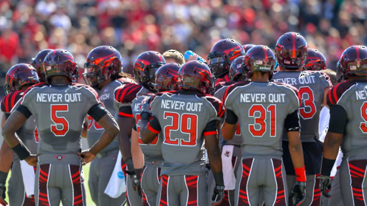
No. 10: The Big Tyme Sports uniforms from 2000-02

No. 10: The Big Tyme Sports uniforms from 2000-02
When programs make coaching changes, it is common for a uniform redesign to be part of the symbolism behind the changing of the guard. That was the case in 2000 when Tech went from Nike uniforms to the ironically named Big Tyme Sports uniforms.
It wasn’t that the two looks during this period were abominations, but they simply lacked any flare. What’s more, they looked cheap. They looked like the type of knockoff uniforms that are sold at Wal-Mart or the type that is found in the box uniform kits that kids used to get for Christmas in the 1980s.
Many fans did like the fact that Tech was one of the only programs in the nation to wear all-black uniforms at home at the time and that gave the team a distinctive look. What’s more, the white jerseys and pants below the black helmets was a clean look for road games.
But the details of the uniforms were poorly executed. The rounded font of the numbers didn’t look right for football jerseys and the triangular designs around the sleeves and the collar looked like something you might expect to see in a Santa Fe rug emporium. Those details were intended to play upon Tech’s Spanish Renaissance architecture, which defines the look of the buildings on campus, but they were too subtle to achieve the point.
What was worst of all was that in an era when Nike was the dominant outfitter in the nation, Tech left that company to sign with one that no one had ever heard of. Not surprisingly, Big Tyme Sports never took off and the only lasting memory we have of their uniforms was the stick figure logo that looked like the stick figure that the rock band Pearl Jam used to use on its merchandise in the 1990s.
So if you ever see highlights from that three-year run and wonder what that logo is, you now know that it is the symbol of what has to be the most obscure uniform supplier Tech has ever worn. Though the Big Tyme Sports look was far from nauseating, it lacked sizzle and that’s why it checks in at No. 10 on our list.
