No. 7: Holiday Bowl 2013
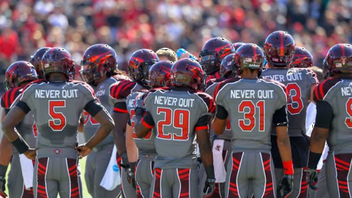
One of the best wins of the Kliff Kingsbury era, the 37-23 upset of No. 14 Arizona State in the 20113 Holiday Bowl, came despite the fact that Tech was in an awful uniform. Again sporting gray as the primary color, the Red Raiders also took some liberties with the helmet and the results were not as intended.
What didn’t make sense with these helmets was the fact that the school’s iconic Double T was nowhere to be seen. That’s a marketing mistake when your team is pulling off an upset on national television.
Instead, Tech went with a helmet design that was half futuristic and half old-school. Both were awful.
On the right side of the helmet was the logo of the Masked Rider coming straight towards the viewer. On the other side was the number of each individual player.
Making matters worse was the fact that the chrome coloring of the helmet decals made it extremely difficult to tell what was on the helmets, especially on the Masked Rider side. Overall, the look felt like Tech was trying too hard to be on the cutting edge of the uniform revolution.
The Double T should always be the most prominent part of the Red Raiders’ helmet. It is what the school has spent decades promoting and at every opportunity, it needs to be displayed.
At least these uniforms put the gray jerseys against black pants. That provided a decent contrast to make the look pop a little bit more. But because the Double T was wiped off of this uniform design, it has to be considered one of the program’s biggest fashion mistakes.
