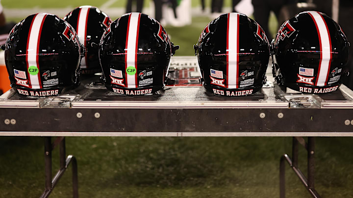
The Texas Tech football program is going to look a little different starting next season. To be fair, so much of Texas Tech athletics will look a little different next year. And that’s because the Red Raiders are adopting an updated version of the classic and iconic Double T logo.
It’s pretty great. I’m a fan of it.
That said, an interesting part of all of this is how there are media members and fans who have very strong opinions on Texas Tech’s revived logos and refreshed branding. And it’s particularly interesting because it really seems like some folks don’t understand the full context about the history of the Double T logo and how E.Y. Freeland helped popularize it.
Texas Tech is breaking out a refreshed version of an old logo and college football fans seem perplexed
I mean, here’s a small sample of that:
Change is a good, natural thing in design, especially for sports logos & uniforms
— Zach Cohen (@ZachCohenFB) October 7, 2025
But this change, by Texas Tech, is not good imo
The new logo looks dull & naked, like it got stripped of its personality https://t.co/dmd413ZM6U pic.twitter.com/eLKus40pdV
Disgusting. The new logo is so bad and I don’t even care about Texas tech. Stripping a logo of character doesn’t make it modern. https://t.co/hcgfK1Nxxs
— Garrett Bell (@Garrett40Bell) October 7, 2025
Left: logo. Right: clip art
— Chris Comeau (@chrismcomeau) October 7, 2025
I look at it and I can imagine jaggies around the outside where the background was removed. IYKYK
We’re talking about one of the first symbols and design elements that was attached to the Texas Tech football program because of how coaches sewed it on the sweaters for football players.
They un-beveled the interlocking T’s. Tough day for @SickosCommittee 😞
— DraftKings (@DraftKings) October 7, 2025
Why does "modernize" in rebranding just mean boring and plain?
— MicahMillion (@IAmMicahMillion) October 7, 2025
— Ian (@LeanHamNeeson) October 7, 2025
That was, of course, all the way back when Texas Tech was known as the Matadors (which is just truly fantastic to look back on, by the way).
And so, it’s so interesting to me that people would be against the rejection of a design trend from the early 2000’s and the embrace of one of the earliest aspects of Texas Tech’s football history.
It could truly be a misunderstanding sort of thing. It could be that there are people who just don’t have the understanding of the connection between this refreshed logo and this program. Or maybe they just don’t like it from a design perspective alone. If the latter is the case, that is such a shame.
If it’s just an issue of understanding, this is a great opportunity to share some of the history behind this logo and why the Red Raiders are embracing it once again.
